Movie posters are generally a consumers first look of a film/TV show. It’s meant to promote not only its title and main stars, but also give information as to what the film pertains. While some movie posters may be a bit more ambiguous than the others, they are meant to be a sneak peak into the theme of the film. Color palette, text font and character/object disposition can tell a lot about the theme of a film.
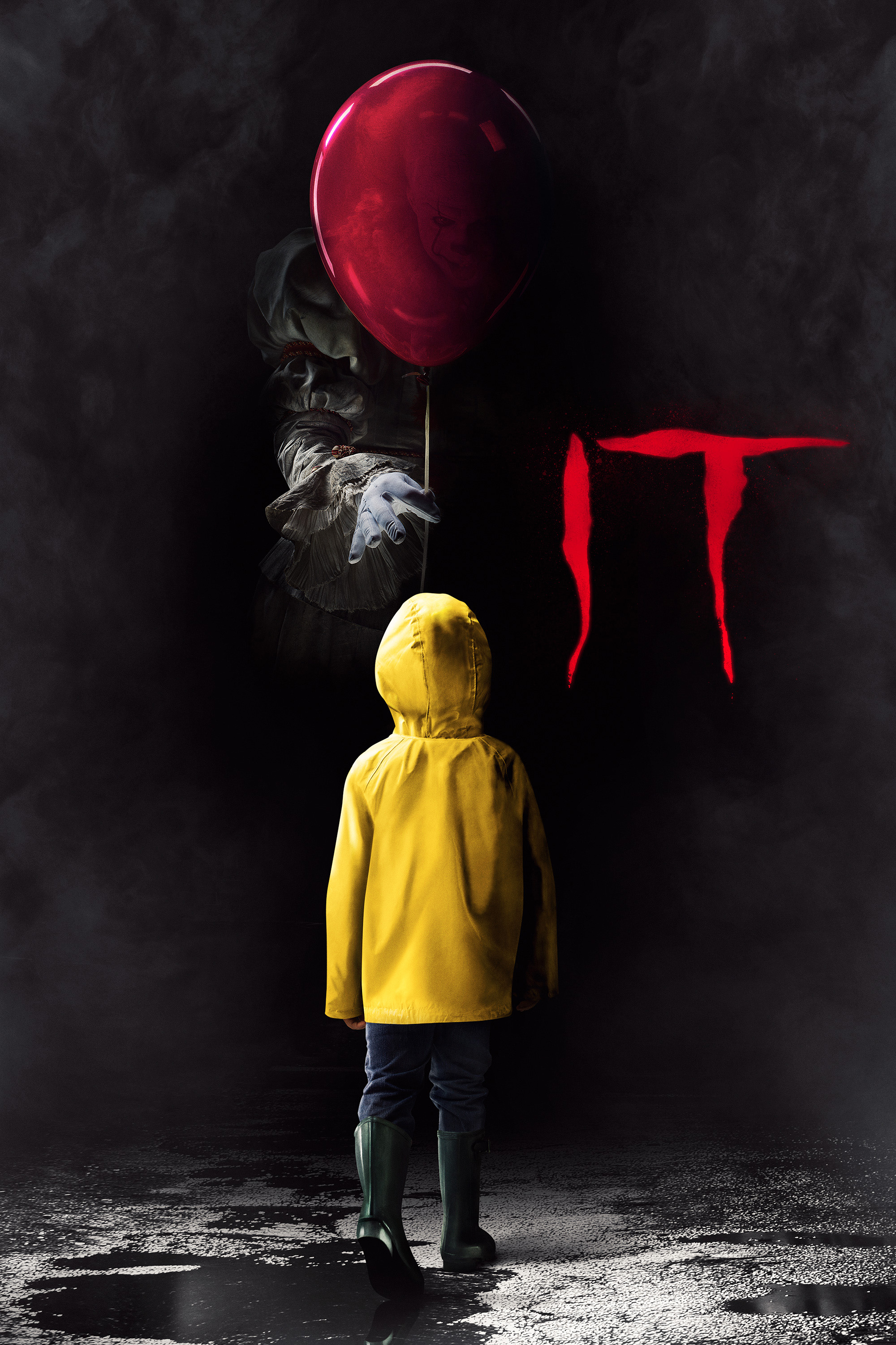
Here is an example from the IT poster released in 2017.
The poster presents a color palette of rich reds and black with the use of white and yellow. Notice the font of IT. The font is a bit jagged, as if a knife or sharp object created the scratched appearance of the lettering. Generally speaking, this type of font is commonly seen in horror films. Sharp edges and deep reds are notably symbols of terrifying things to come. While most people tend to know the story of IT based on the critically acclaimed novel, its always the job of a marketing team to assume this is the audience’s first introduction to the story.
Also notice that we can see neither Pennywise or Georgie’s (yellow coat) face. In horror films, what we don’t see can sometimes be scarier than what we do see, so this design definitely works in story’s favor. If this was a comedy about a happy clown, we would probably see Pennywise’s face and the color palette (as well as the font) would be dramatically different. As a comparison, here is a poster for another Warner Brothers film, Pee-Wee’s Big Adventure. While Pee-Wee isn’t necessarily a clown, his mannerisms are very silly and clown-like. Here is a comparison of both of their posters. Look at the color contrast!

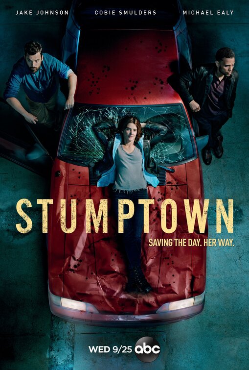
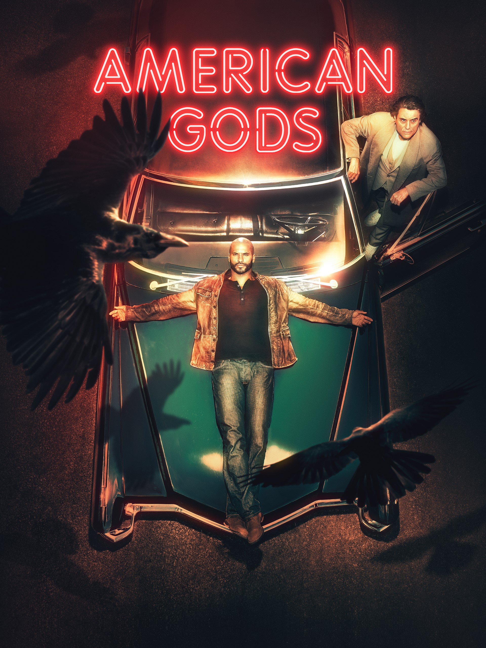
The whole idea of this article came when I was making one of my many drives down Santa Monica Blvd on my way to work. I had noticed numerous Stumptown posters plastered on billboards, bus benches and of course bus stops. The following day I noticed what appeared to be the exact poster design but for a different show called American Gods. I was astonished at the distinct similarities.
The composition of post Stumptown and American Gods is nearly the same. Take a look at the guy to the left of Colbie Smolders in Stumptown. He is a near perfect mirror of the man to the right of the car in American Gods! While both shows have different fonts and color palettes, I couldn’t believe how eerily similar they were in design. Was this intentional? Perhaps. Although, I think this is too much of a happy coincidence! But then again, things like this always happen (read further!) Also, it’s worth noting that American Gods has been released since 2017 while Stumptown is in its premier season this Fall.
Comedies / Battle of the Sexes
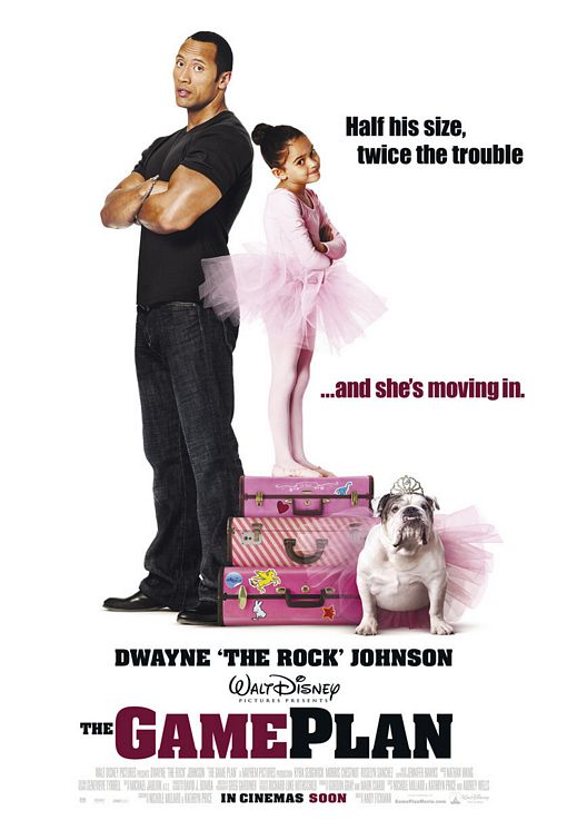
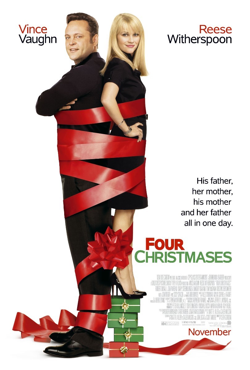
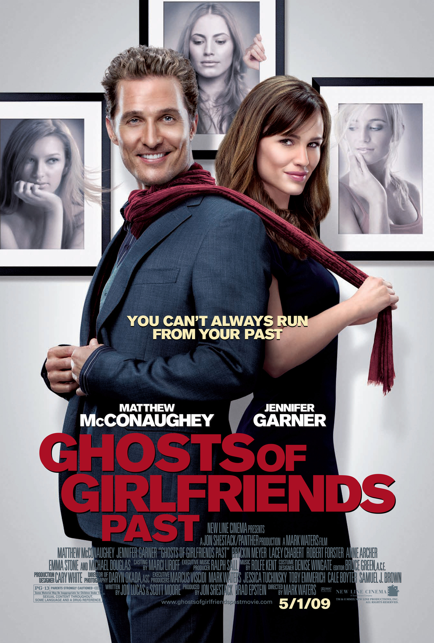
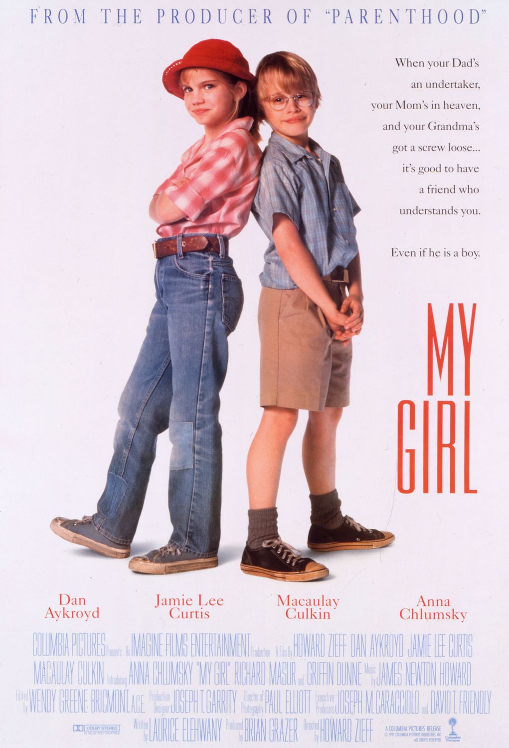
Marketing teams know what films were box office hits and what works in terms of poster design. For example, a film with a duo Vince Vaughn and Reese Witherspoon (Four Christmases) might pull similar attraction to the same crowd who enjoyed the film The Game Plan starring The Rock and a young Maddison Pettish. While both films have different contextual meanings and issues at hand, their poster will remind you of the feel good movie of the year you saw and how you felt about it. Keep in mind, The Game Plan came out in 2007, and Four Christmases came out only a year later in 2008. Several other films have copied a similar design as seen below. Romantic comedies and even kid friendly comedies, tend to attract a similar pool all around for their sweet stories. Theres definitely a hint of battle of boy vs. girl in terms of design. Also notice how nearly all five of these posters have the tallest party on the left and the slug lines on the right side of the poster. Ah, composition.
Strange Coincidences: Say What?
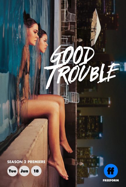
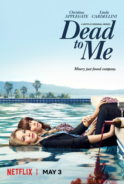
Most recently, there was a bit of an uproar about the poster design for two different shows on two different networks. The first poster released was for Freeform’s spin-off show of The Fosters titled, Good Trouble. Around the release of this poster (much like Stumptown and American Gods) a similar poster design of two women in a pool came out for the Netflix Original show, Dead To Me. While these two posters are strikingly similar, it may have been a bizarre coincidence, and an interesting one at that! At times, we may be influenced subconsciously by what we see and desire to create (at first) what we believe is an original design. Or perhaps, this was just a case of two designers creating nearly the same design, which I fully believe is the case in this situation. What are your thoughts on these designs?
Below are a few more instances of seemingly non-discreet uses of similar poster designs. Whether or not these designs were of inspiration or just a copy cat, is solely left for open interpretation. I believe it is a mixture of both. With an abundance of content these days, an original idea is hard to come by.
Giant Eyes


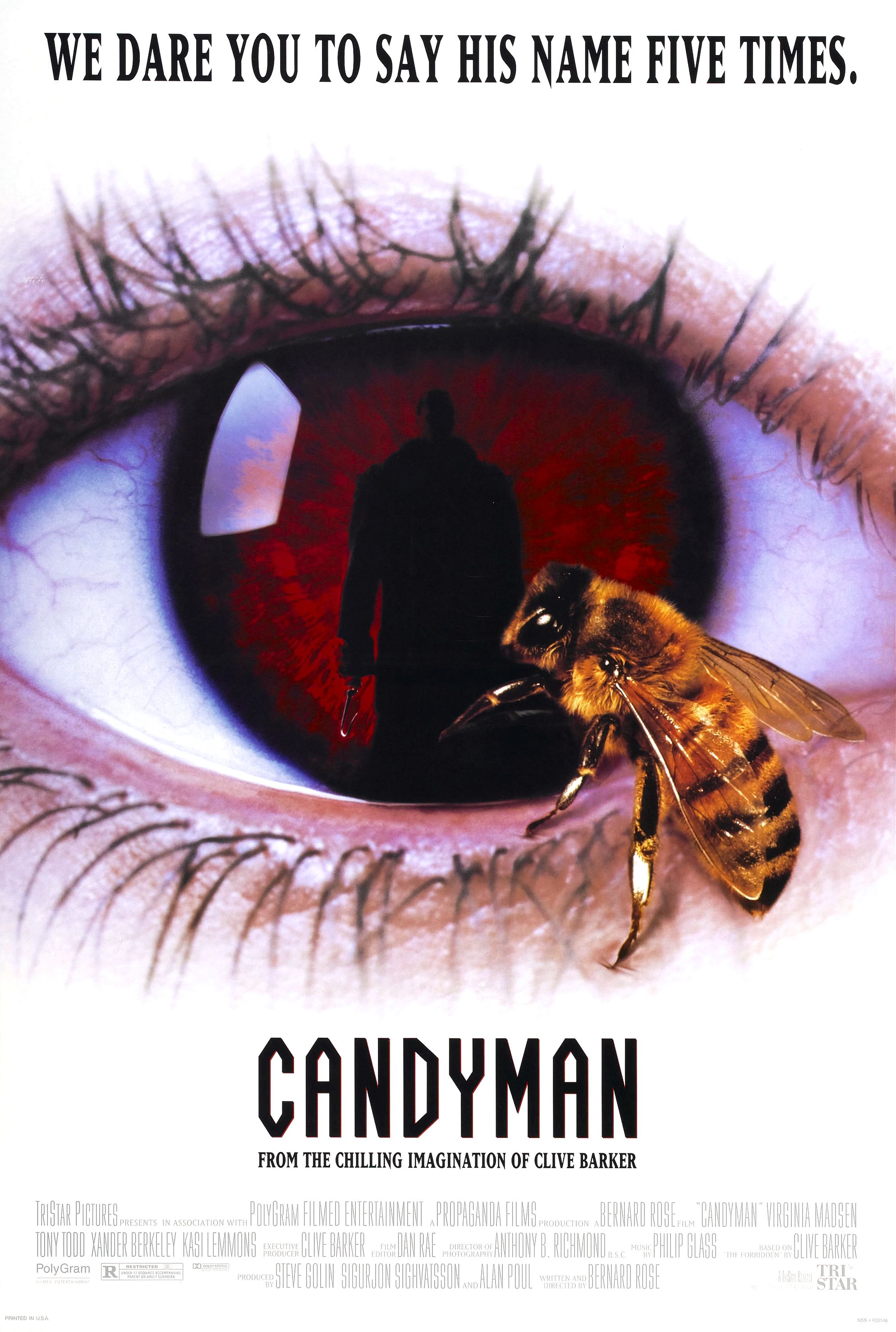
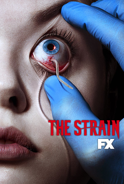
Large eyes on a poster can be evasive, creepy and occasionally, down right disturbing. The eye is one of the most sensitive organs of our body and the thought of anything getting into them (let a alone a parasite) can be quite spine chilling. Which works in the favor of creative marketing when promoting a studio/network’s latest thriller film. Personally, all four of these posters disturb me in a way, mostly because I can’t even imagine something being that close to my eye, let alone an insect going near it. Again, these types of explicit imagery work greatly in the favor of these marketing techniques.
Action Films
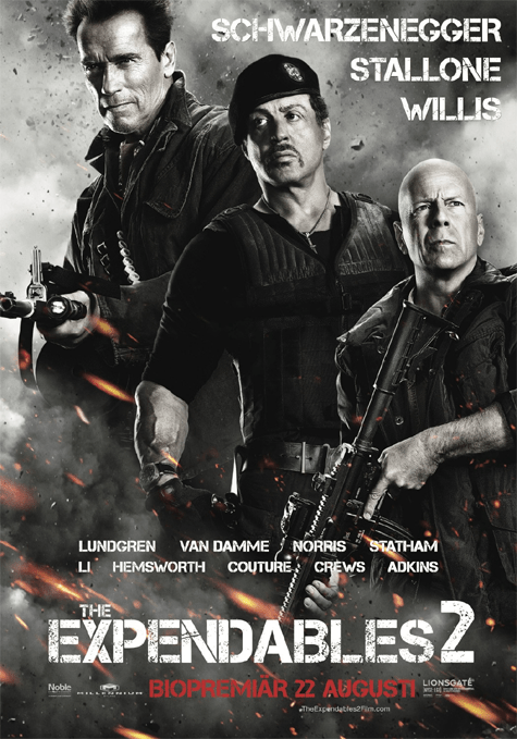
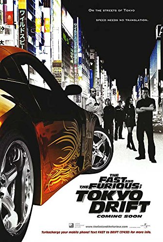
Action films such as The Expendables or The Fast & The Furious: Tokyo Drift love using black and white with hints of color in its poster designs, specifically warm tone colors. These poster designs are heavily influenced from Japanese action films who use similar color designs. The black and white photography paired with an almost “burning” effect with the warm pops of color really add a mysterious and enticing draw to their design.
Action/Adventure (Tier Design)
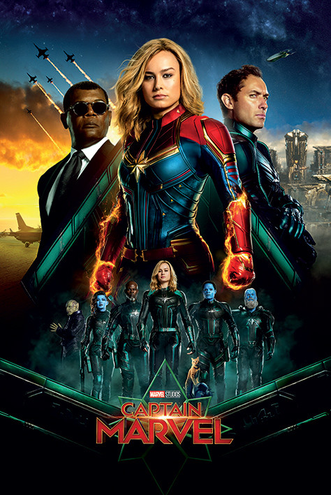
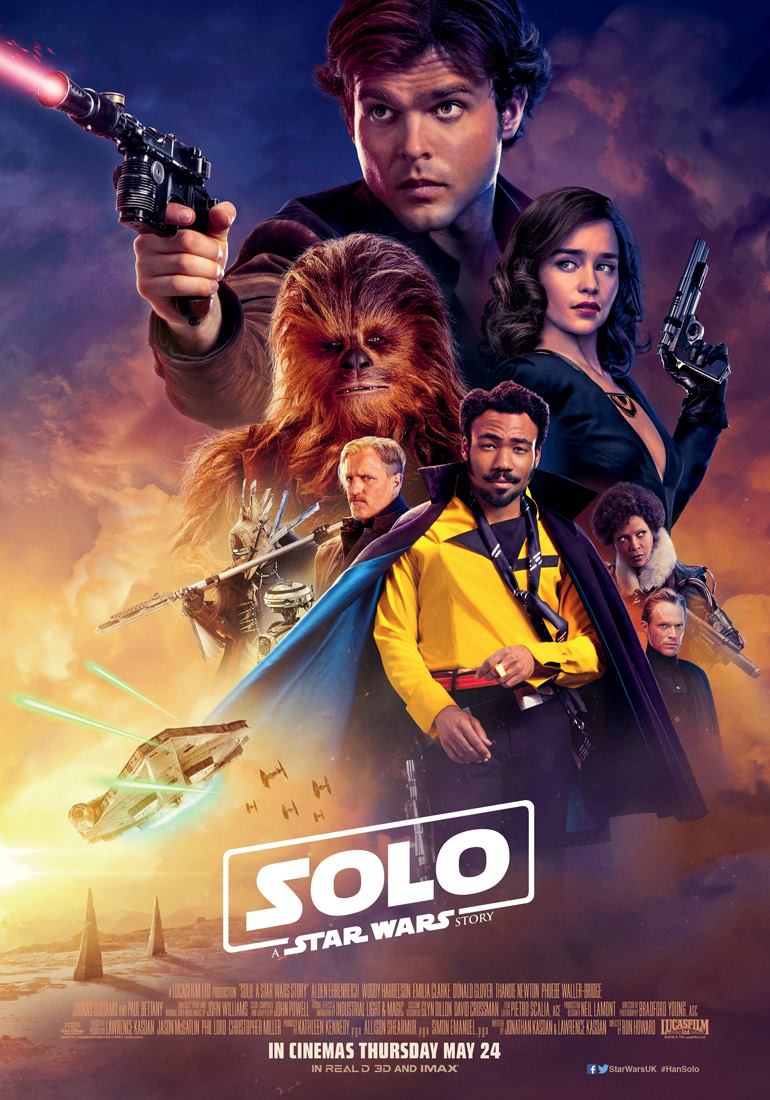
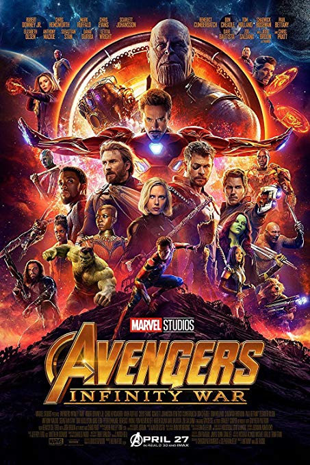
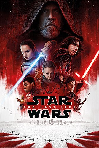
Sci-Fi thrillers and superhero films have been some of the biggest blockbusters known in Hollywood. While they are action packed with innovative adventure, they also require a large cast. With a star studded cast such as Robert Downey Jr, Gwyneth Paltrow and Scarlet Johansson, it can be difficult to decide who will be largely represented on the official Avengers: Infinity War poster design. While each of their characters are widely important, action films featuring a large cast often depict the “leading” character of the story as the biggest element of the poster. The rest of the tier represent characters that are also in the film but who may not be as pertinent to the story as the others. Also notice the combination of warm and cool tones working together in these designs. Marvel Universe, Star Wars and DC Universe poster designs will rarely have a lack of color. Superheroes are known for a wide array of colored suits and outerwear as a form of creating distinction between multiple characters. (Star Wars does this generally with the use of lightsabers)
While this article can go on about the several other uses of signaler poster design, I will wrap up by saying that rarely is a design ever “unique” or an original idea. Ideas for films (Even those we haven’t necessarily seen before) are a mixture of ideas, influences and inspiration from previous works. However, one should always pay gratitude and thanks to those influences as oppose to taking full credit for an idea. It’s okay to borrow and form new ideas from inspirations, but permission and of course acknowledgment to these works should always be critical. Filmmaker and artists refer to this as homage, or rather, paying tribute to our artistic influences when creating our own.
What do you think? Are some of these designs are inspired by successful designs of the past, or do you believe they are simply “borrowed”? Sound off below and share with me some designs you’ve noticed in the past!
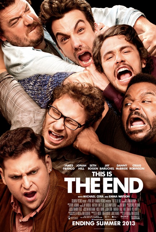
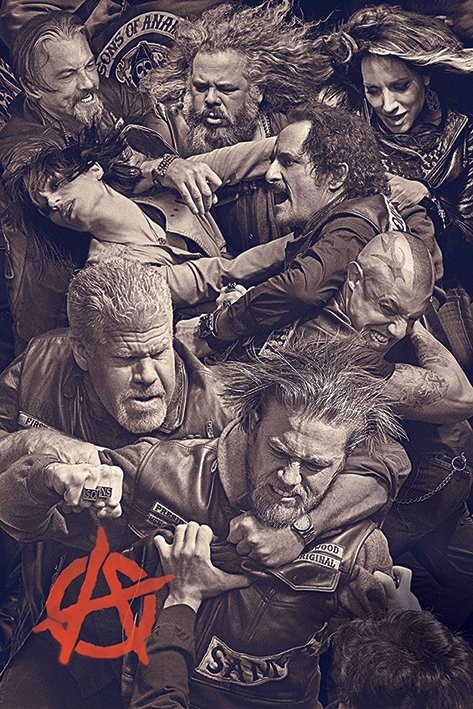
Here are a few more miscellaneous posters to compare.

*All of the discussed poster designs belong to the studios that made them*
